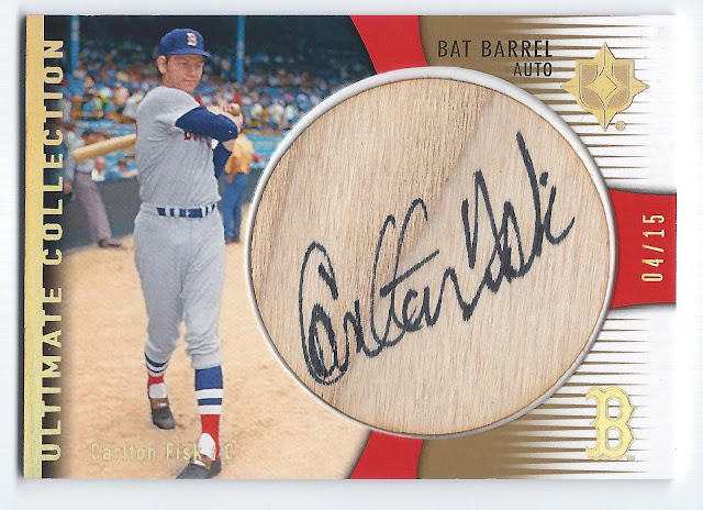
 It is difficult to come up with appropriate words for how great this card is. To say I am completely stoked to own it is an understatement. When it came up for auction, it was one of those cards that I had never seen an example of before - ever - and I've looked at several auction sites for Fisk cards every single day for fifteen years. With only 15 ever made and no telling how many actually in circulation, for this to come up for sale is a very rare event. Which is to say I thought I had absolutely no chance to own it. I put in my max bid, sighed a longing, woeful sigh, and moved on with my life. On the day the auction closed I was stunned that I had won it.
 As I've said over and over (and many of you collectors agree with me), the Upper Deck designs around this period are unparalleled. This card is no exception. Graphically, all the elements just work. The horizontal orientation of the card combined with the vertical graphics is the foundation of it. Then throw in a few contrasting horizontal lines in a matching gold color. All of that draws your eye to the centerpiece gigantic on-barrel autograph :) And numbered to 15? Any collector would just say "wow".
My only knock on this card would apply to many others - the photography. All of the companies use and re-use the same couple dozen old photographs of Fisk over and over and over. I realize there are not an unlimited number of quality Fisk images from the 1970's. But it sure seems as if UD and Topps especially are not going out of their way to uncover or discover any more of them. Seems like a cost saving move to me. Especially on high-end cards, collectors expect better. One suggestion would be to use action shots rather than posed photos. There would be a great deal more of them and acquiring rights to a handful of old press photos can't be that cost prohibitive.
In the case of this 2008 card, I immediately noticed that the photo is the exact same shot, albeit cropped differently, that Upper Deck used just two years later on another high-end Fisk card in the Exquisite line. Here's a side-by-side:
 |
| 2010 UD Exquisite |
 |
| 2008 UD Ultimate |
